
Creditkarma.com
a robust data visualization library to improve member experience and support design teams

Overview
Partnership goal
Create reusable data visualization (DV) patterns to be added to the Credit Karma Design System (KPL).
Outcomes:
10 data visualization components covering the majority of use cases based on user centered roles
Straightforward, easy to understand charts that improve member engagement
Designers can create new data visualizations from existing components with a cohesive look, feel, and interaction
Comprehensive DV guidelines and tools enabling designers to quickly determine which component to use
Agency Team
Team Leads – David Landa, Crystal Chen
Senior Product Designer – Victor Kim
Principal Product Designer – Ryan Ganss
Users & Stakeholders
Credit Karma Vertical Designers
Design System + Engineering teams
Credit Karma Members
Credit Karma Executive Leadership
Key Results
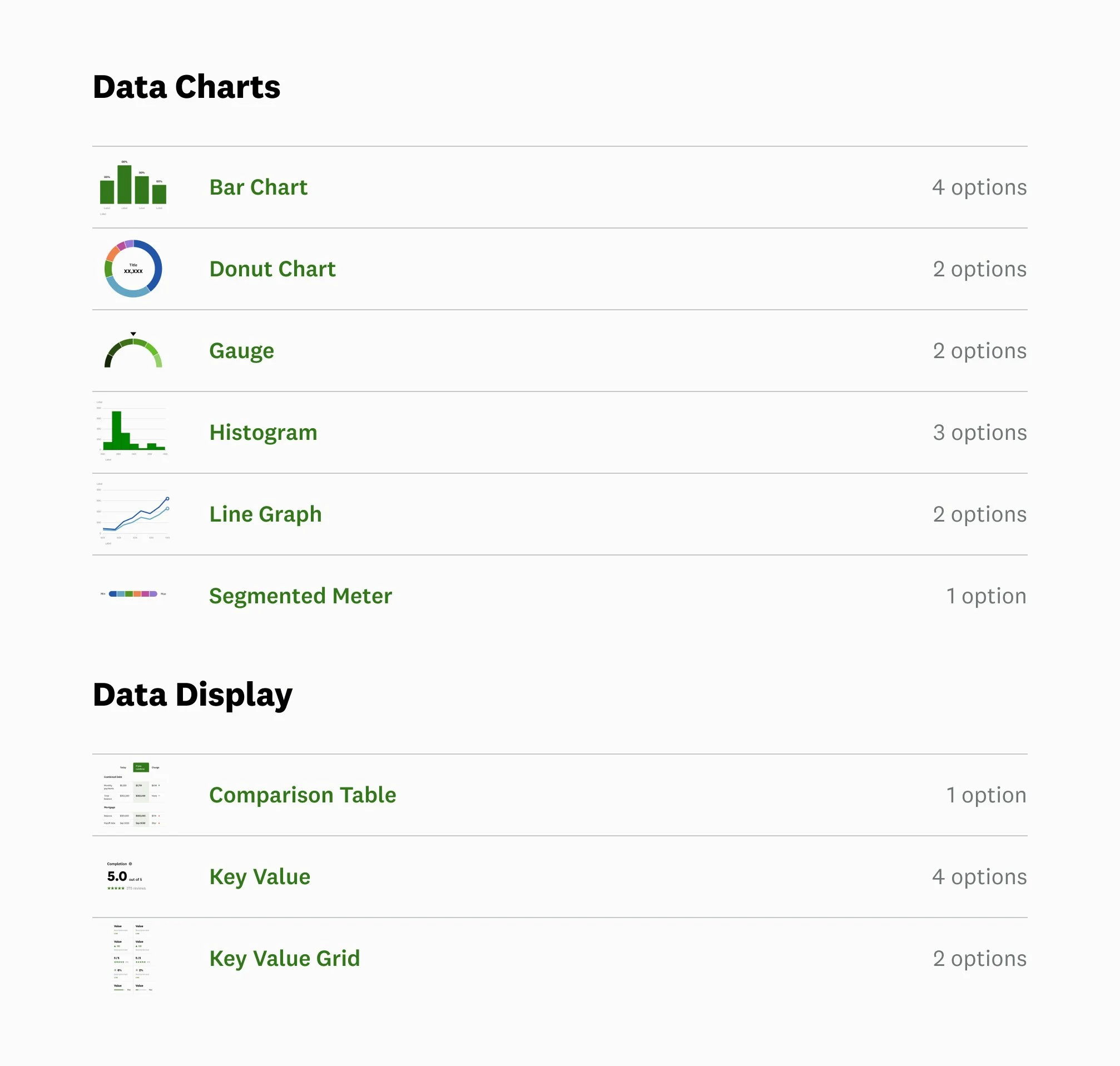
Data Visualization library
We committed 10 data visualization components to the KPL design system and defined user-centered roles to match data visualization to member needs.

SCALABLE BUILDING BLOCKS
By focusing on patterns made up of widely applicable components, we empower vertical designers to compose vast amounts of data driven member stories.

EXTENDED DV COLOR PALETTE
The data visualization color palette is derived from the core brand palette and meets W3C accessibility requirements while also satisfying the unique data visualization requirements.

Documentation example for the Line Graph including a summary with UX roles, inspiration mockups, and detailed component composition with set up instructions.

Component build breakdown with detailed interactivity.
Custom Figma plugin for designers to filter pre configured data visualization chart types by UX role. The plugin leverages a chart type sticker sheet that allows for simple updates without requiring engineering resources.
GUIDANCE & TOOLING
Provided documentation and tooling will give designers a boost in choosing the right data visualization for specific member needs.
Best practices documentation for each DV
Intuitive component builds
Custom Internal Figma plugin tool to guide DV selection

INTERACTIVITY
The system includes implementation guidelines for highly interactive graphs such as Line, Bar, Meter and Donut.
Focuses a member on highlighted data points
Increases chart utility and enhances user experience